Experience design for user-generated notes in an enterprise SaaS research admin application
Company: A 6,000-person consulting firm
Project Summary
I led the redesign of a major feature, Reviewer Notes, to be used across a 6-module web application to capture data quality assurance remarks.
The web application is a SaaS enterprise application for managing research administration at colleges, universities, and other research institutions.
Responsibilities
Competitive Research
Experience Design
Design Ops
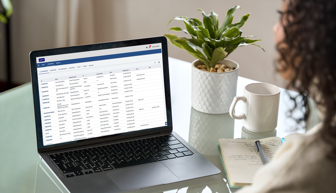
Main project list of the research administration application.
PROCESS
I led this 6-month remote project from research through component specification, collaborating closely with Product Managers and Engineers
Phase I: Interviews, User Group feedback, and heuristic analysis
Stakeholder interviews, user group feedback, and heuristic analysis of current workflows, interaction patterns, and UI to develop list of pain points and must haves.
Phase II: Develop requirements and create wireframes and mock-ups
Working out how to handle: multiple-role workflows, placement of slide-in panel, interaction of slide-in components, interaction between base-screen and slide-in, flow of notes within reviewer notes panel.
Phase III: Feedback from Engineering, Product, and UX Leadership
Walk-through of experience design with representatives from Product Management, Engineering, and UX Leadership. Iterate on interface until stakeholder team consensus reached.
Phase IV: Create specifications and mock-ups for design system
Tighten workflow mock-ups until pixel-perfect. Hand off to junior designer to create specifications for new components. Review with Engineering team to sort out how to best build the components and patterns.
RESEARCH
Stakeholder interviews, user group feedback, and heuristic analysis revealed a cognitive load issue with switching between the reviewer notes modal and the base page in the legacy interface
The previous version of the product used modals for all reviewer note taking, sharing, and reviewing.
When making or reviewing notes, the modal covered the area of the base page that was being reviewed.
Users were forced to close the modal every time they wanted to reference the base page.
Cognitive load issues were encountered when moving between the modal and the base page.
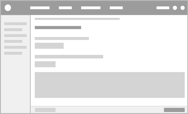
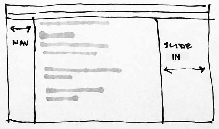
Wireframe of the data gathering form showing sub-navigation at left and form at right.
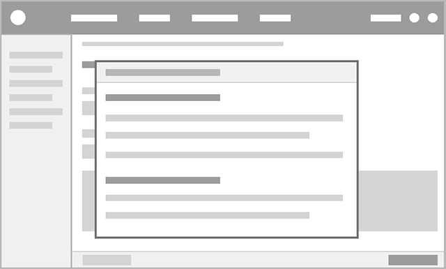
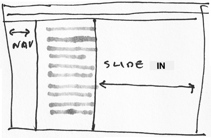
Wireframe of the form showing the legacy reviewer notes modal obscuring the form.
PRODUCT STRATEGY
Because the slide-in component was already an established part of the UI framework, it made sense to use it to contain the reviewer notes
Left-anchored slide-in
This placement caused a conflict with the left navigation, which was also collapsible.Right-anchored narrow slide-in
This placement and width allowed for note taking while referring to the base page.Right-anchored wide slide-in
This was the correct anchoring, but it obscured the base page.
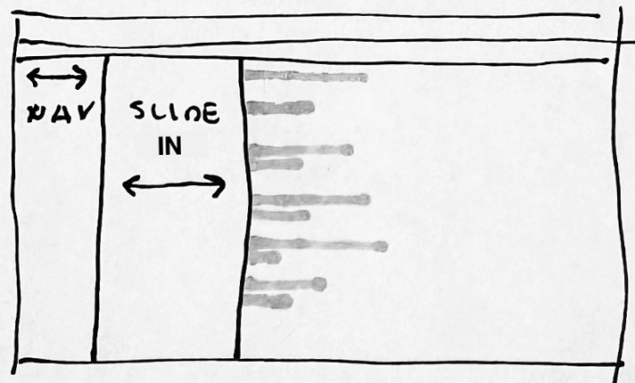
1.
2.
3.
EXPERIENCE DESIGN
Workflow walk through: Amy, the Reviewer, starts at the Project List Page, selects a project, reviews the form for data accuracy, and makes notes where changes need to be made
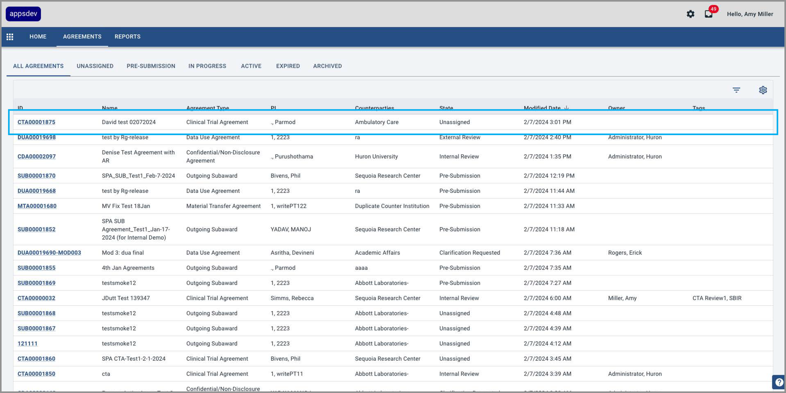
1 Amy selects a project from the project list datagrid.
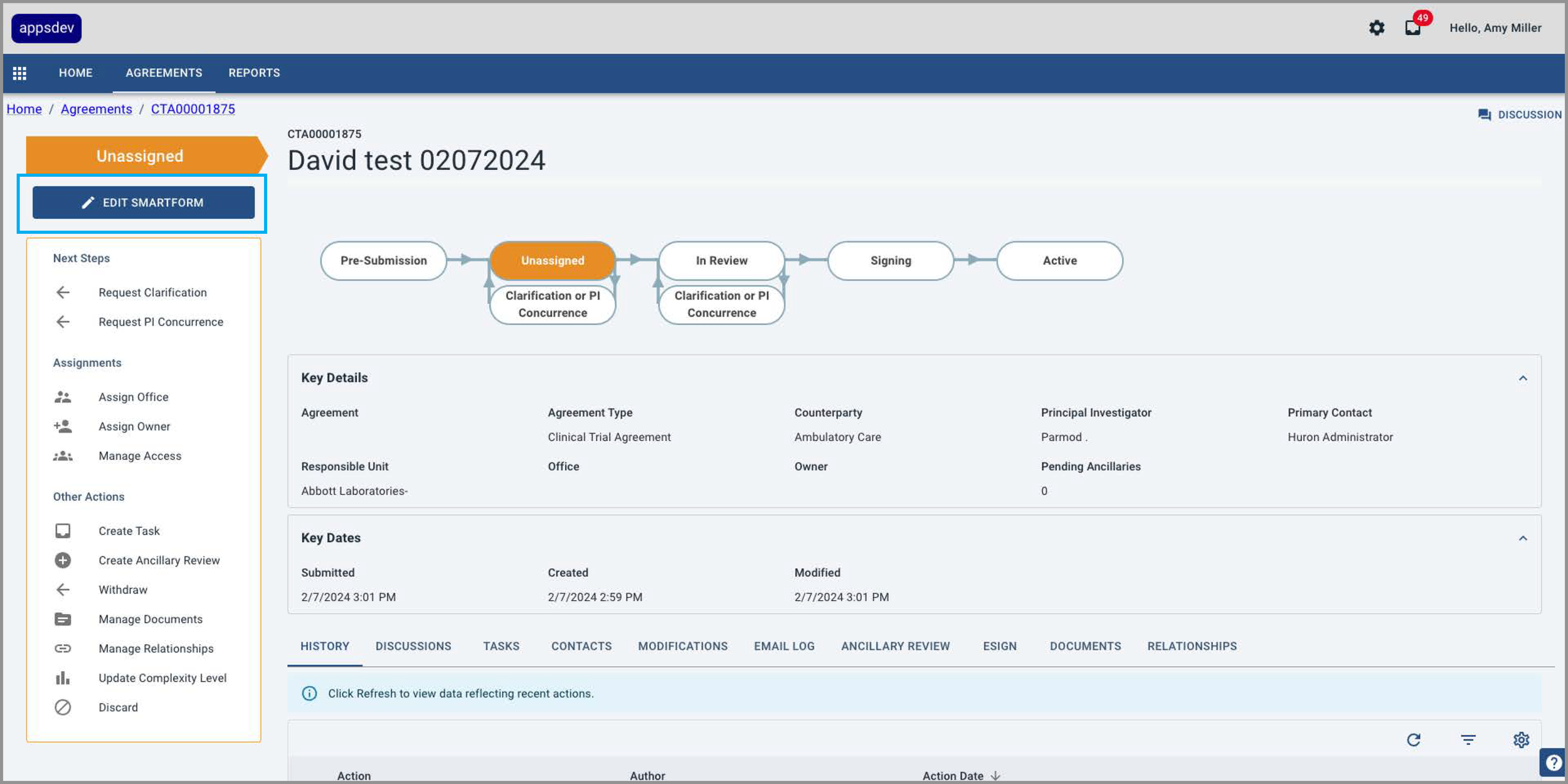
2 She then selects the “Edit Smartform” button.
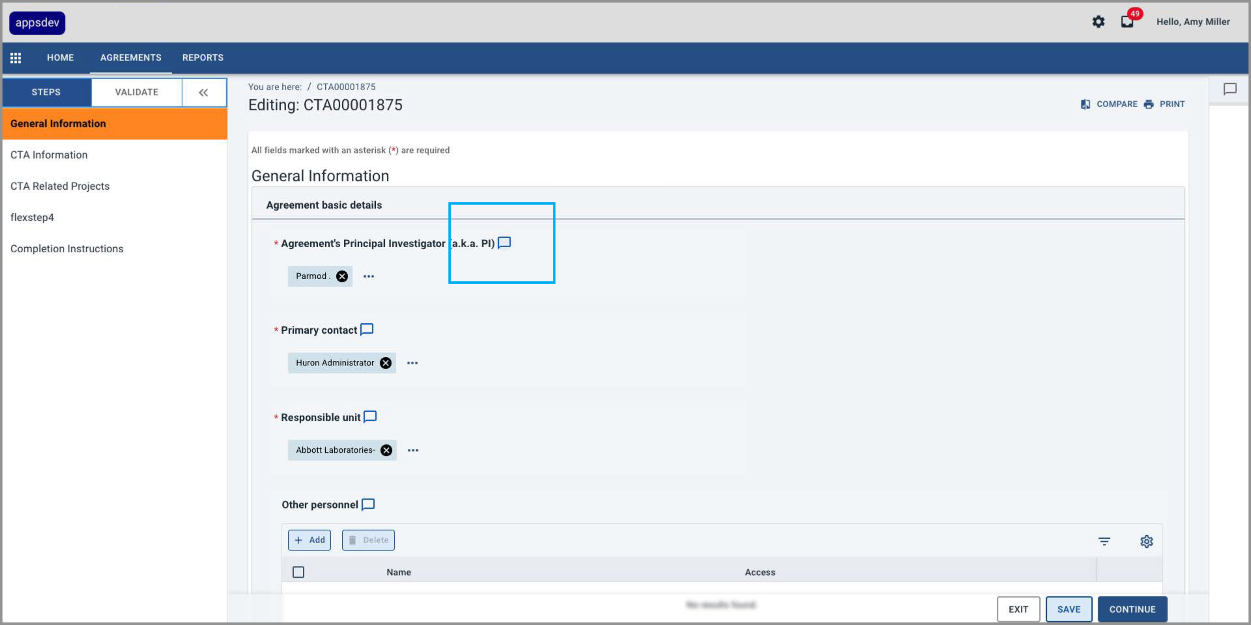
3 In the form, an outline Reviewer Notes icon indicates there are no notes associated with that form field.
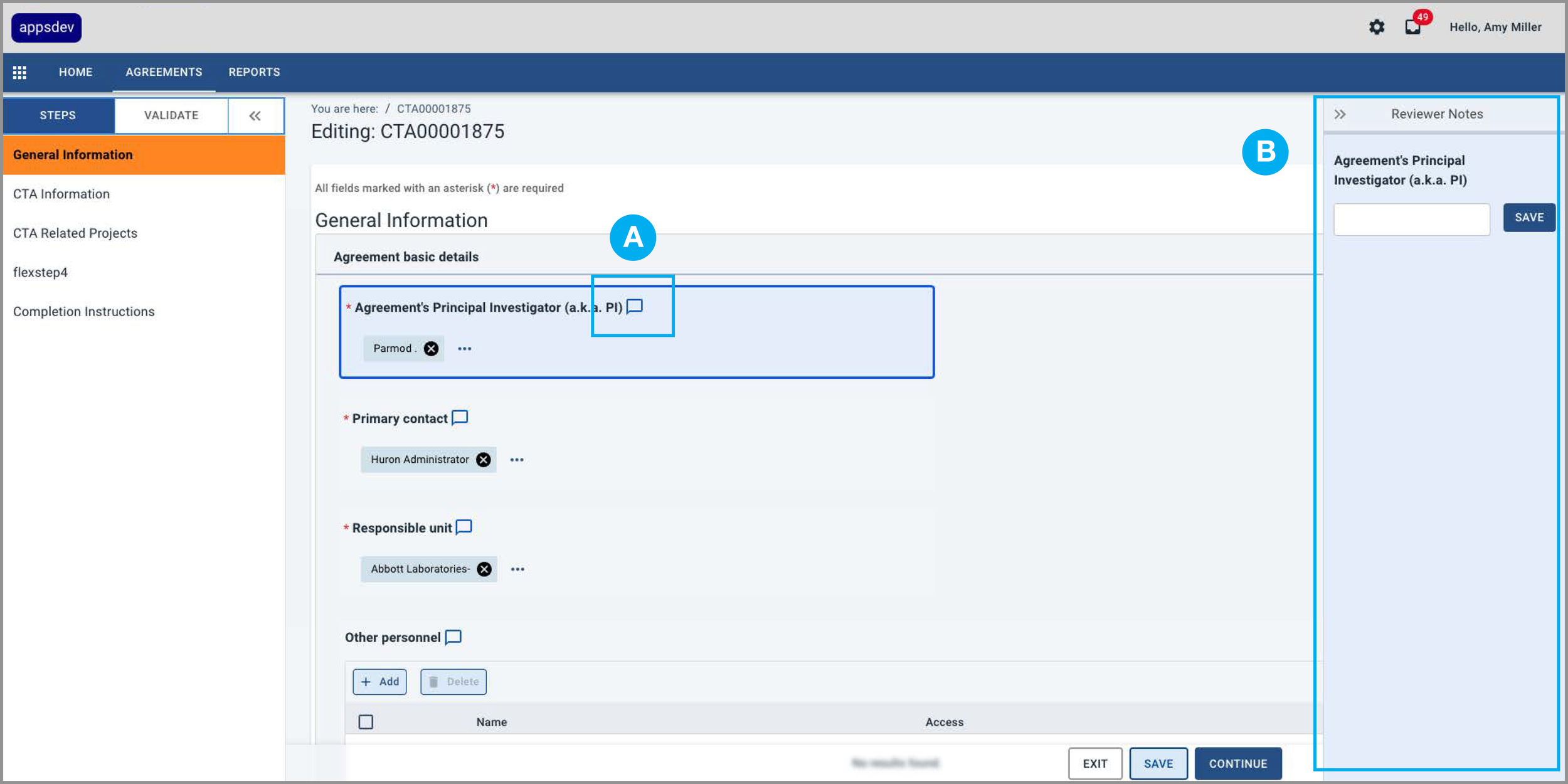
4 When the icon is selected (A), the field highlights with a border and fill, and the Reviewer Notes panel (B) opens at the right edge of the screen.
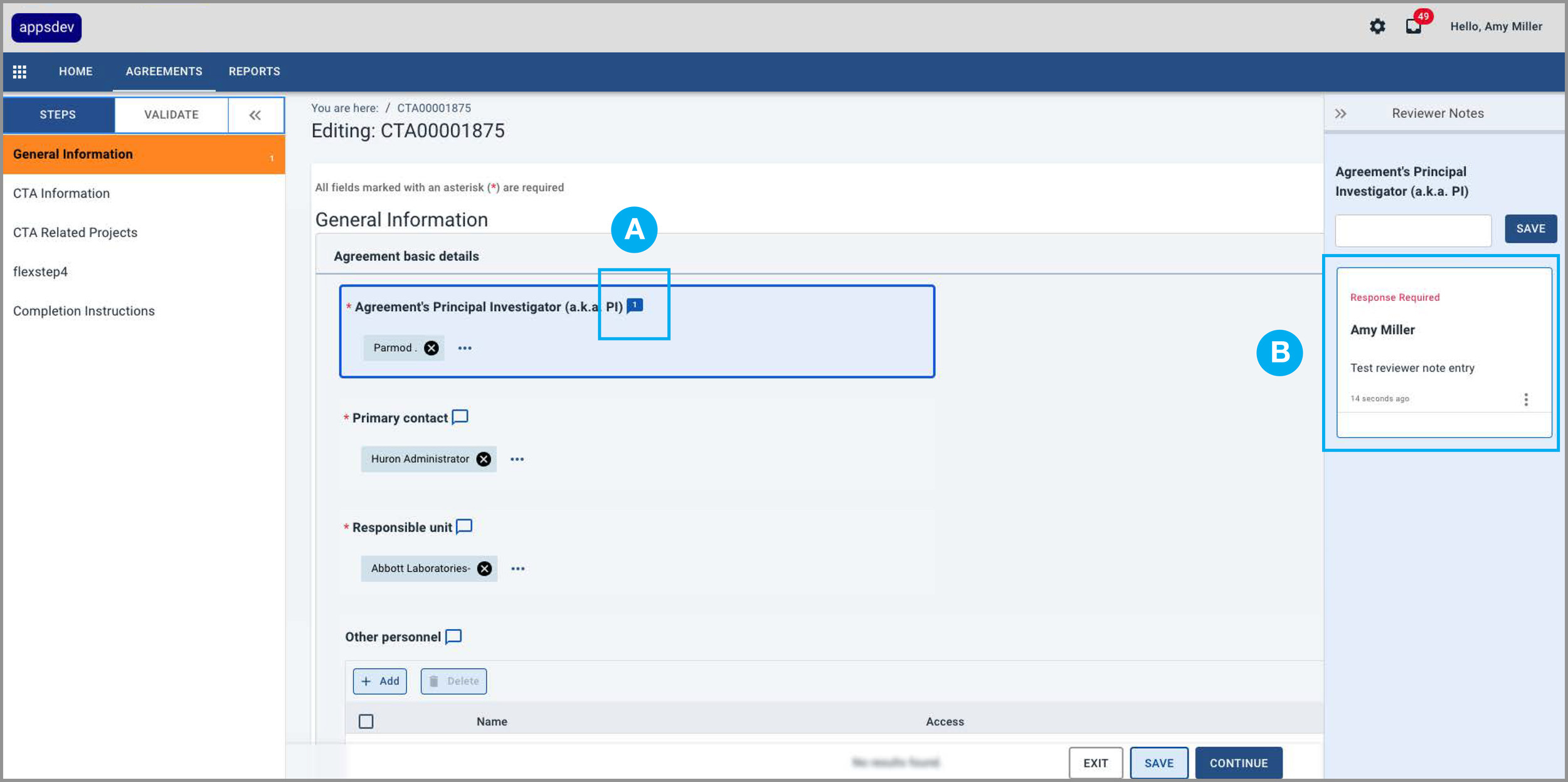
5 A solid Reviewer Notes icon (A) indicates there is a note (B) in the Reviewer Notes panel.
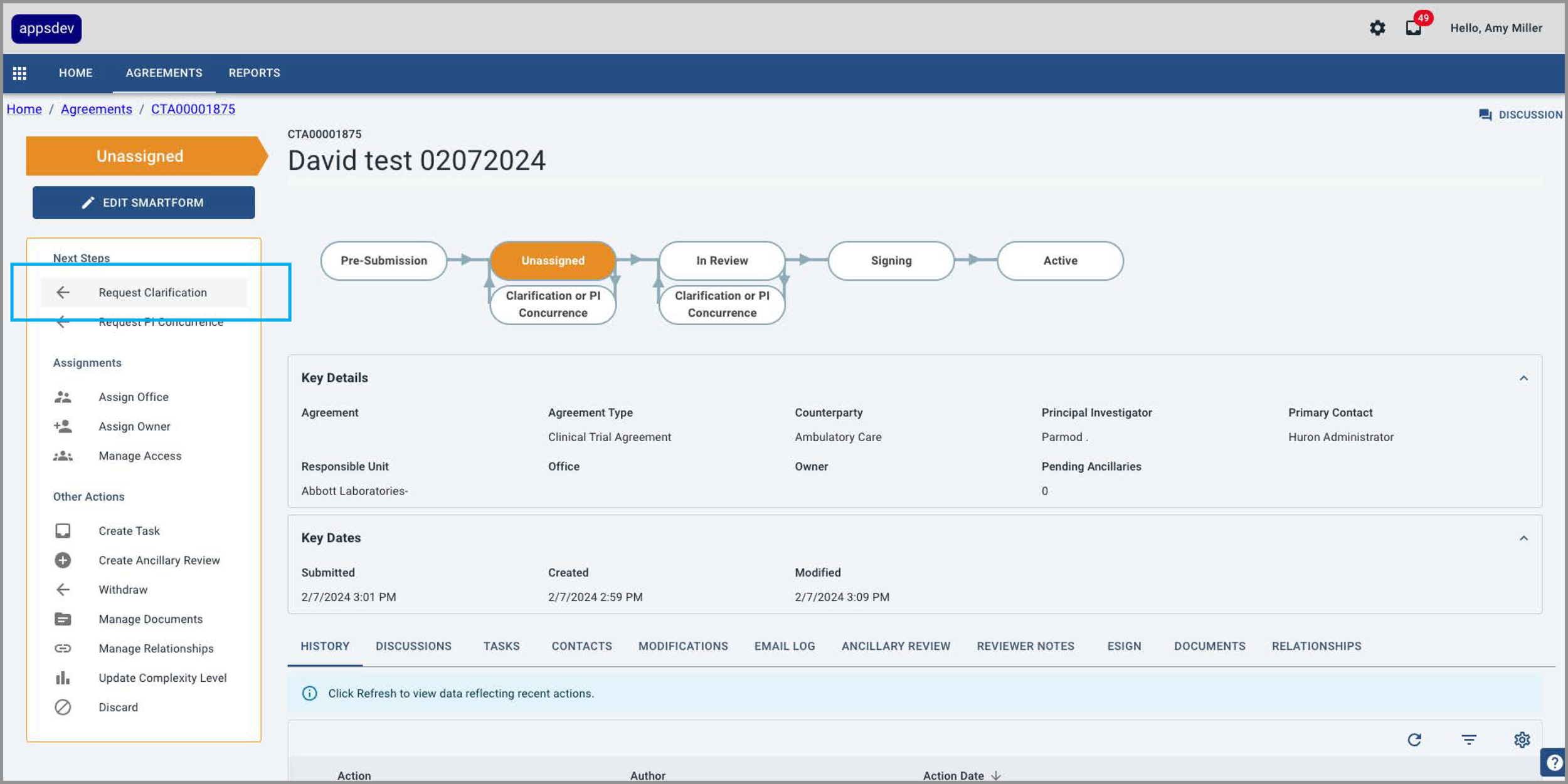
6 Amy submits the project using the Request Clarification button in the Action Panel at left.
EXPERIENCE DESIGN
Justin, The Project Principal Investigator, makes changes to the form and then responds to Amy’s note indicating what revisions he has made
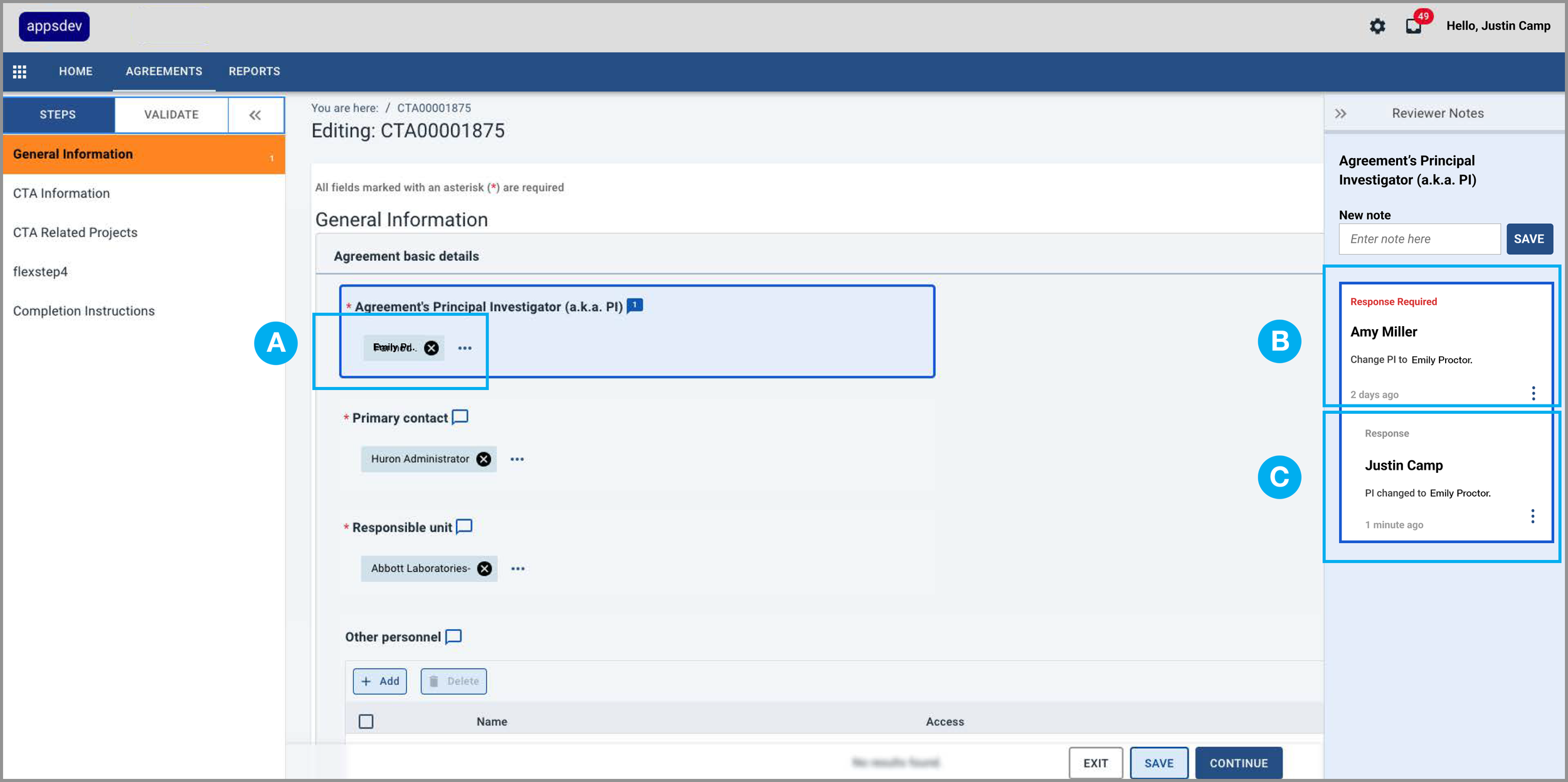
Justin changes the Principal Investigator to Emily Proctor (A) per Amy’s request (B) and then adds a response (C) to Amy’s note indicating he has made the change.
EXPERIENCE DESIGN
Amy reviews the form data and Justin’s response and then resolves her original Reviewer Note
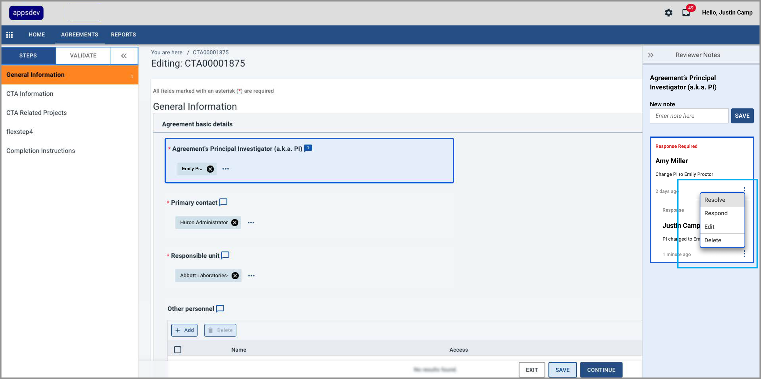
Amy reviews the form data and Justin’s response and then selects the “Resolve” option in the note’s kabob menu.
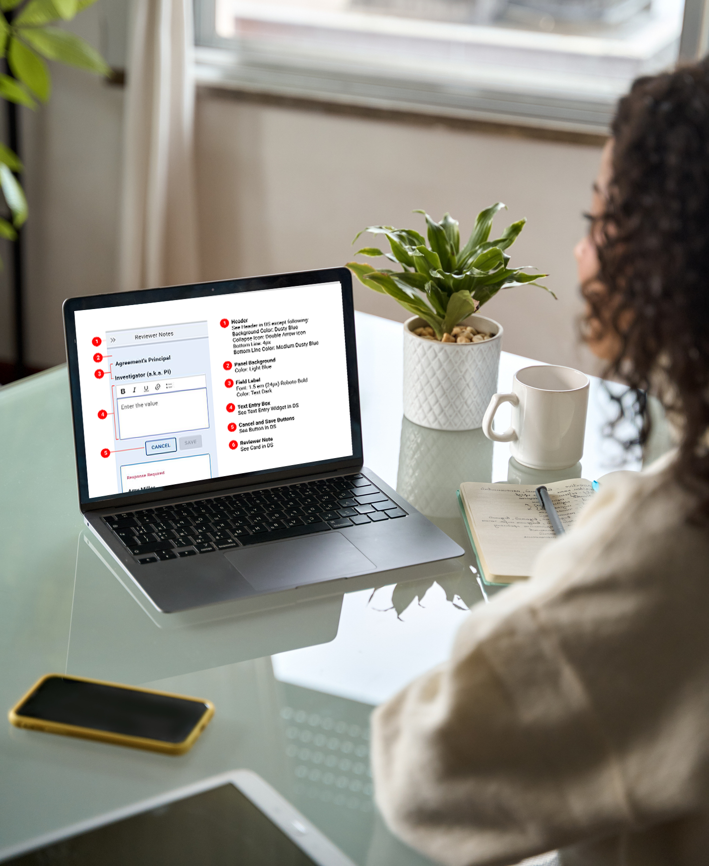
DESIGN OPS
To drive consistency and scalability, I developed design system components in Figma
I created final specs and incorporated them into the existing design system.
I collaborated with the engineering team to ensure correctly coded components.
I reviewed the coded components in the staging environment to ensure consistency and quality.