Experience design for a healthcare patient satisfaction tracker
Company: A Vault Top-20 Consulting Firm
Project Summary
The purpose of this project was to modernize the 15-year-old enterprise application’s user experience by adding more robust system metrics and a dashboard which surfaced those metrics, along with action items and email notifications.
Responsibilities
Cross-functional Leadership
Information Architecture
Experience Design
Process
Requirements development
Product Strategy
Workflow & screen design
Present to stakeholder group
Iterate
PROCESS
I led the cross-functional team, experience design, user interface design, information architecture, and presented progress to the larger stakeholder group at regular milestones
Phase I: Requirements Development
User research was completed before I joined the project and primarily delineated the required content of the dashboard and that the app would be used significantly on mobile and tablet.
Phase II: Product Strategy
I proposed using a card-based dashboard design that would accommodate functionality modules and responsiveness. The cards could layout across the screen and then down to form a grid. Individual cards could then wrap onto a new line for narrower form factors like tablet and mobile.
Phase III: Experience Design
Once information architecture, workflow, and layout were outlined in wireframes, Interaction patterns and detailed interface were established in pixel-perfect screen mockups.
Phase IV: Present to Stakeholder Group
Stakeholder presentations were based loosely on a monthly cadence. I led the reviews for the first months and then the Product Owner took them over once the design was not completely new to everyone.
REQUIREMENTS DEVELOPMENT
The dashboard would be the centerpiece of the redesigned app along with expanded reporting and responsiveness to mobile and tablet
New or expanded features that the application needed:
Dashboard
Action items (To do list)
System metrics (rounds completed vs rounds remaining, for example)
User notifications (mostly for scheduled reports)
Expanded reporting
Expand beyond person objects into pure objects (objects could be people or things now—they were only people in the old version)
Responsive to tablet and mobile

PRODUCT STRATEGY & EXPERIENCE DESIGN
To accommodate the requirements, I proposed a card-based interface for the dashboard
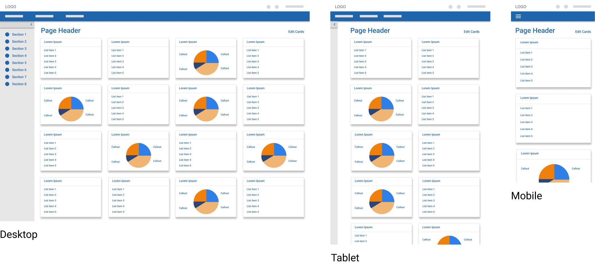
The card-based interface, as shown in the mockups, would meet the requirements by:
reserving space for one functionality type per card, for example:
Action items
System metrics / reporting
User notifications
Responding to mobile and tablet seamlessly—the cards would wrap according to the form-factor:
Desktop—four cards wide
Tablet—two cards wide
Mobile—one card wide
Side navigation would be collapsible to allow more cards per row (see Tablet mockup).
Site-wide navigation and side navigation would fold into a hamburger menu icon for mobile.
PRESENT TO STAKEHOLDER GROUP
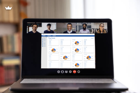
To build trust within the large stakeholder group, I remotely presented final mockups
The stakeholder group consisted of the following teams:
Customer success
Product
Engineering
The bulk of the presentation was spent:
Answering questions
Explaining the rationale behind the design